Notes on “Camp”
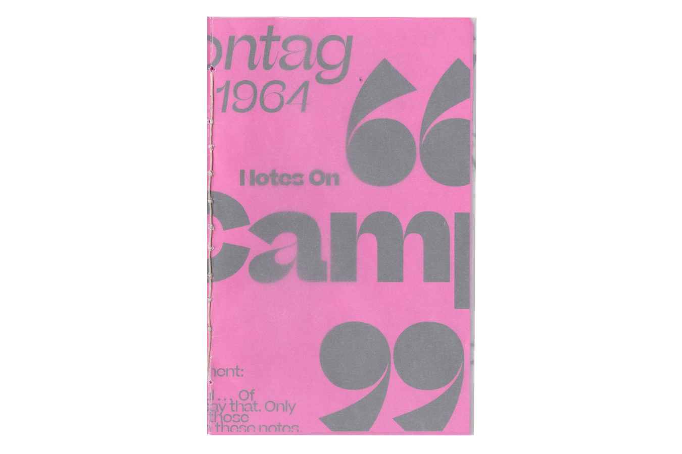


In this project, I chose to typeset a gallery guide for Susan Sontag’s Notes on “Camp”. I deduced that “camp” simply meant an aesthetic that is playful, theatrical, and exaggerated. Additionally, it is a sensibility that sees the importance in stylization rather than the content. With that in mind, I wanted the gallery guide to reflect the aesthetic of “camp”.
MillerKnoll Workplace Research Library


This project was to design the identity for MillerKnoll’s sub-brand of the Workplace Research Library. In this project, I wanted to bring in elements from the pre-existing identity of MillerKnoll and creating my own based on the sub-brand.
Taiwanese
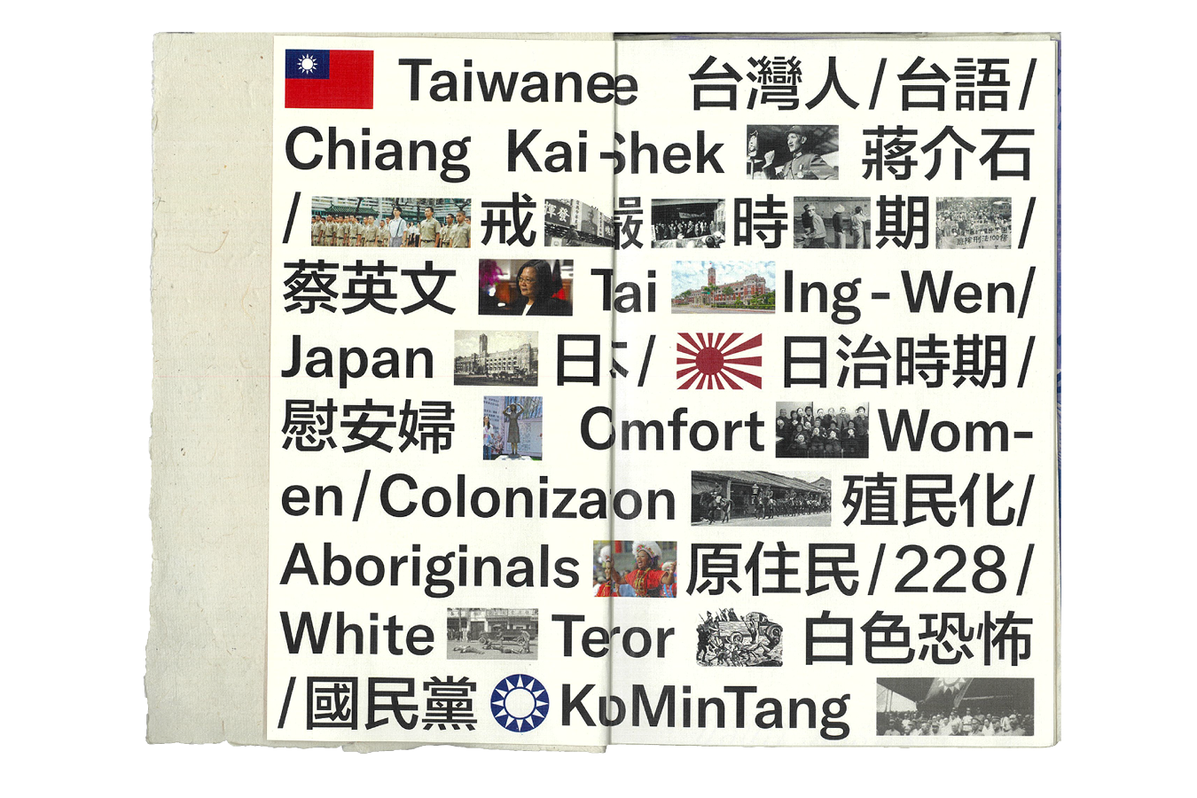


Combining my cultural identity as a Taiwanese person, I chose to create a booklet on the national identity of Taiwan. The objective of the booklet is to educate those on what it means as a nation to lose their identity to centuries of different colonizers attempting to wipe out their identity. The book mainly focuses on different aspects of Japanese and Chinese colonization of Taiwan.
OK


Creation of a visual identity for a social campaign on raising awareness for toxic positivity, where the goal is to educate people on how positivity could be twisted in a way where it becomes harmful and toxic to others.
Strctre

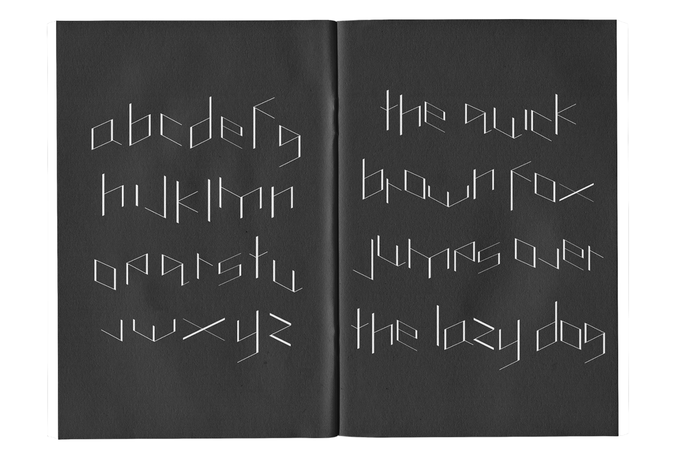
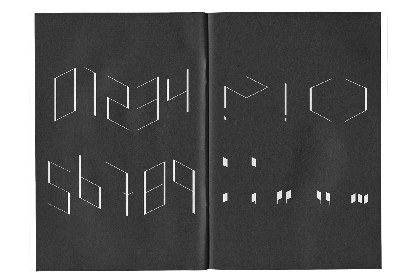
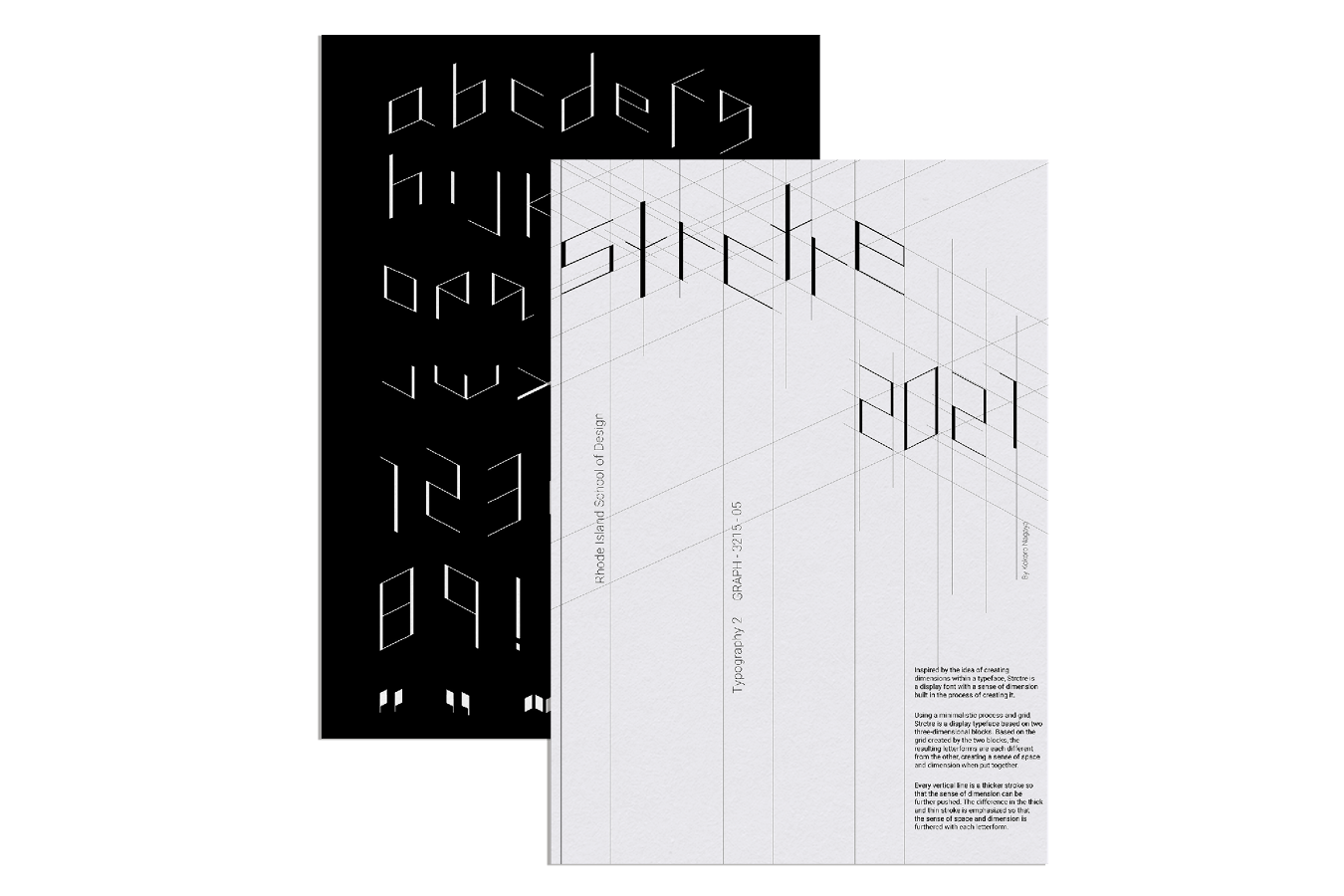
Designing a typeface unconstrained by the two-dimensional nature of print through using a three-dimensional grid in the design of the type. Resulting in an elegant and minimalist sans serif display typeface that brings dynamics to the mostly static nature of print.
A Fisherman of the Inland Sea


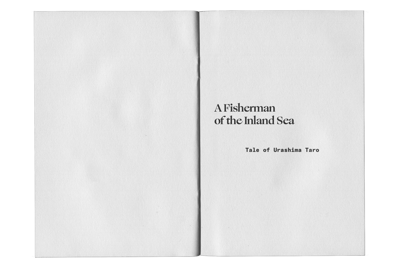


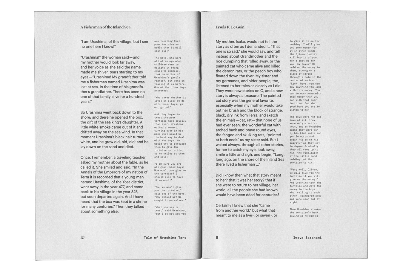
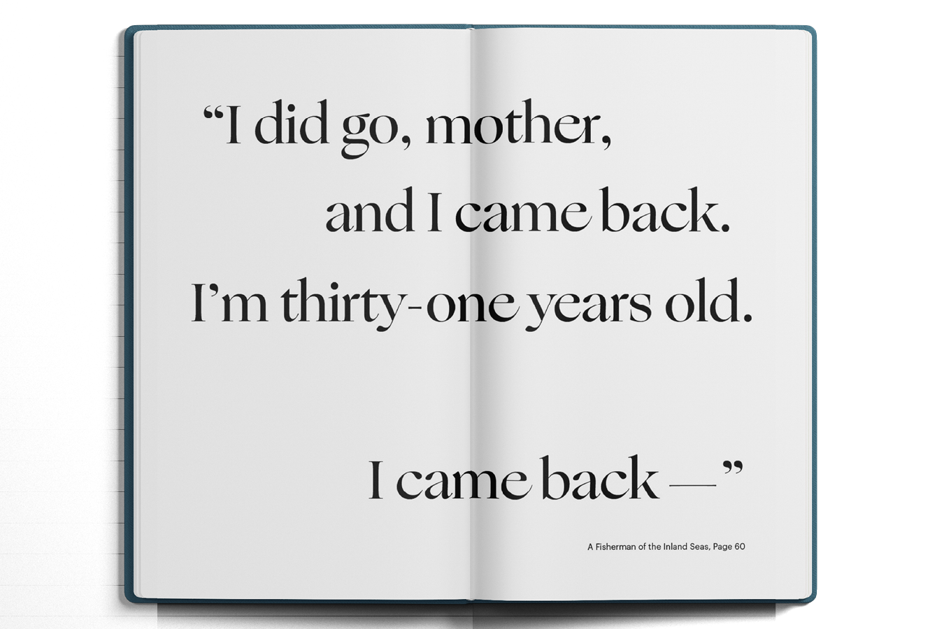


In this project I decided to typeset and design the book cover for the short story of ‘A Fisherman of the Inland Sea’ by Ursula K. LeGuin along with an accompanying text of the ‘Tale of Urashima Taro’. The reason why I chose the Japanese tale to accompany my primary text, ‘A Fisherman of the Inland Sea’ is due to the similarity of the theme. The theme of loneliness due to homesickness and being far from home is seen throughout both text, and is incorporated in the design choices of the book.
Playful Flirting
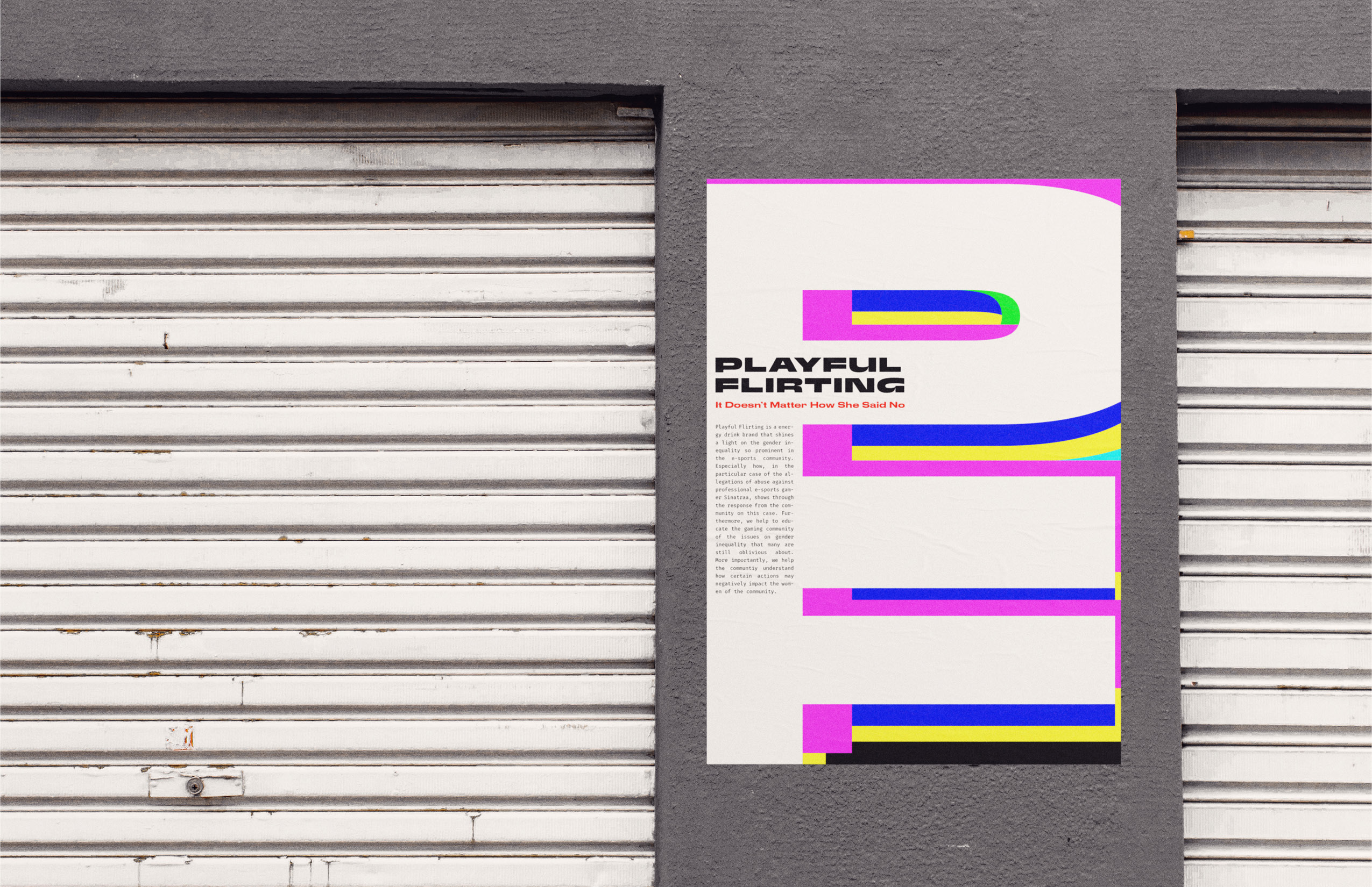
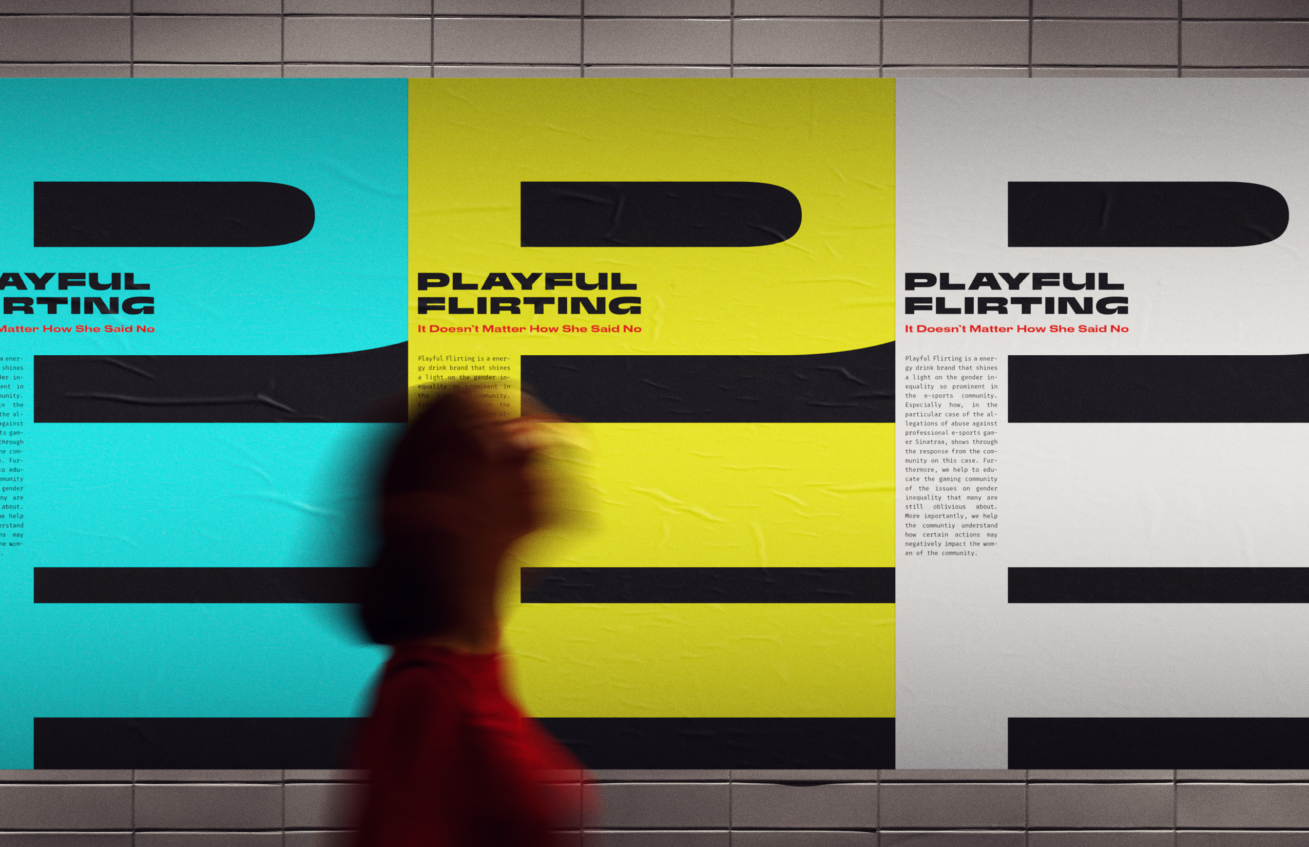

In this project, I took a social problem I witnessed and created a brand around the cultural movement. So in this project, I took a problem I saw in the e-sports community, and created a brand around the movement that will allow me to convey the problem. Thus I decided to look further into a recent incident in the e-sports community involving a professional e-sports player and his ex girlfriend. The name, ‘Playful Flirting’ came from the many responses surrounding the incident, in which most highlights the problem of masculine toxicity in the community.