Notes on "Camp"


Notes on "Camp" written by Susan Sontag is a list explaining what the aesthetic of “camp” means. I deduced that “camp” simply meant an aesthetic that is playful, theatrical, and exaggerated. This is the reason Beatrice Display by Sharp Type Foundry is used throughout the gallery guide. The strokes are exaggerated in its thick and thin, giving it a playful and theatrical feeling when used. Pairing it with a grotesque and mono typeface, like GT America and GT America Mono by Grilli Type, allows the Beatrice typeface to take the center stage.
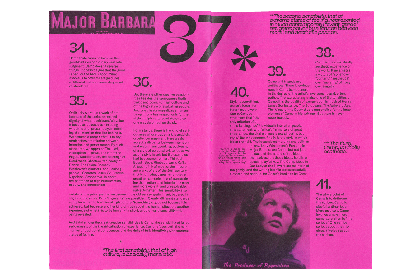
My decision to print the gallery guide onto neon pink paper is to bring the “camp” through using this flamboyant shade of paper. The decision to bind the gallery guide by hand is to further the“camp” sensibility, as other forms of binding (such as stapling) just didn't feel like "camp" to me. Additionally, the style of binding I chose was also meant to add playfulness.
Relief Spread
For Susan Sontag's fourth note on “camp”, she gives a list of example on what camp is. Since the author decided to give this note a slight different format, I decided to continue this idea. Thus I brought the list out and made a special spread within the inner pages, and give it a completely different rule for its typesetting. Combining the use of the regular and italics of the Beatrice typeface, I intentionally closed up the leading between the lines so that the type was touching each other. I then layered images over the type that gave additional explanation to what the objects listed were. Using vellum, the translucent page and the type on it created a playful look when overlapped onto the inner pages.

Relief Spread (printed on vellum)
Cover
The cover extends all the way around the book; from the back cover to the front then into the first page as well as the final page. This to me adds another level of playfulness to the book, as it is important that the cover of the book matches the tone of the inner pages.
The cover extends all the way around the book; from the back cover to the front then into the first page as well as the final page. This to me adds another level of playfulness to the book, as it is important that the cover of the book matches the tone of the inner pages.
 Front and Back Cover Spread