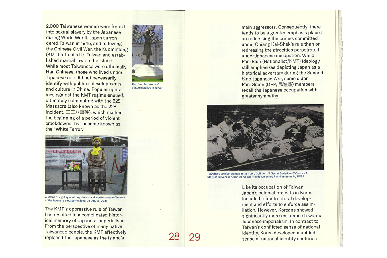
Taiwanese (台灣人)

Book Cover and Binding (with details printed on translucent paper)
The book ‘Taiwanese’ is on my cultural identity as a Taiwanese person. The objective of the booklet is to educate those on what it means as a nation to lose their identity to centuries of different colonizers attempting to wipe out the Taiwanese identity and culture. The book mainly focuses on different aspects of Japanese and Chinese colonization of Taiwan, and specifically the different events or aspects that they have done to try wiping out the Taiwanese culture.
![Front and Back Cover]() Chapters Detail
Chapters Detail
It was very important for the book to bring a sense of agriculture through the materials. Thus I really wanted the paper that I chose to have texture to it. For the inner pages I chose to use a cream linen paper, that can bring the sense of texture throughout the book without overwhelming the reader’s senses. Through more special paper such as the translucent calligraphy paper and hemp paper. This sense of culture and materiality is furthered with my choice to bind the book using the Japanese stab binding technique. Due to the influence of Japanese colonization in Taiwan, there are many books in Taiwan’s past that were binded like this.
Cover
For the cover, I chose to use both the Mandarin and English version of the title ‘Taiwanese’. Specifically I chose to play with the Mandarin type through removing elements of the word ‘Taiwanese’ in order to further the concept of colonization and the attempt to wipe away Taiwanese identity. Thus I removed the mouth (口) from tai (台), removed the speech (言) from wan (灣), and one of the strokes for the word people (人). The reason I remove specifically the word for mouth and speech in each of the characters is to emphasise the lost of freedom for speech during the times of colonization. And through removing one of the strokes for (人) I emphasise on the dehumanization aspect of the Taiwanese people due to colonization.
![Front and Back Cover]() Book Cover (Detail under the translucent layer)
Book Cover (Detail under the translucent layer)
I chose to use the Taiwanese flag colours of red, blue and white as well as the elements of it throughout the book due to the significance it has on the country’s identity. There is a common phrased used in Taiwan to describe the flag, “A red field, with a blue canton containing a 12-ray white sun. (青天白日滿地紅旗)” Where the blue symbolised liberty and nationalism, white symbolised democracy and equality, and red symbolised loyalty.
The flag itself was created by the Chinese colonizers, begging the question as to who exactly does this flag and colours represent? Thus I played with the colour in ways to mock its meanings and the irony of it. This I do the same for the symbol of the sun, where the center is empty, as I question the colonization of the Taiwanese people through the recurring design elements of the flag.
Inner Pages
For the book, I wanted to create a sense of friendliness to the reader to encourage them to open and read the book. Thus I had bigger sized text for the body text of the inner pages, and an easy-to-understand image and text layout. The title of each chapters are also meant to be eye-catching to draw the attention of the reader, which is why the first chapter of the book is named ‘He’s Fucking Everywhere’ (到處他媽的都是蔣介石).
 Chapters Detail
It was very important for the book to bring a sense of agriculture through the materials. Thus I really wanted the paper that I chose to have texture to it. For the inner pages I chose to use a cream linen paper, that can bring the sense of texture throughout the book without overwhelming the reader’s senses. Through more special paper such as the translucent calligraphy paper and hemp paper. This sense of culture and materiality is furthered with my choice to bind the book using the Japanese stab binding technique. Due to the influence of Japanese colonization in Taiwan, there are many books in Taiwan’s past that were binded like this.
Cover
For the cover, I chose to use both the Mandarin and English version of the title ‘Taiwanese’. Specifically I chose to play with the Mandarin type through removing elements of the word ‘Taiwanese’ in order to further the concept of colonization and the attempt to wipe away Taiwanese identity. Thus I removed the mouth (口) from tai (台), removed the speech (言) from wan (灣), and one of the strokes for the word people (人). The reason I remove specifically the word for mouth and speech in each of the characters is to emphasise the lost of freedom for speech during the times of colonization. And through removing one of the strokes for (人) I emphasise on the dehumanization aspect of the Taiwanese people due to colonization.
 Book Cover (Detail under the translucent layer)
I chose to use the Taiwanese flag colours of red, blue and white as well as the elements of it throughout the book due to the significance it has on the country’s identity. There is a common phrased used in Taiwan to describe the flag, “A red field, with a blue canton containing a 12-ray white sun. (青天白日滿地紅旗)” Where the blue symbolised liberty and nationalism, white symbolised democracy and equality, and red symbolised loyalty.
The flag itself was created by the Chinese colonizers, begging the question as to who exactly does this flag and colours represent? Thus I played with the colour in ways to mock its meanings and the irony of it. This I do the same for the symbol of the sun, where the center is empty, as I question the colonization of the Taiwanese people through the recurring design elements of the flag.
Inner Pages
For the book, I wanted to create a sense of friendliness to the reader to encourage them to open and read the book. Thus I had bigger sized text for the body text of the inner pages, and an easy-to-understand image and text layout. The title of each chapters are also meant to be eye-catching to draw the attention of the reader, which is why the first chapter of the book is named ‘He’s Fucking Everywhere’ (到處他媽的都是蔣介石).


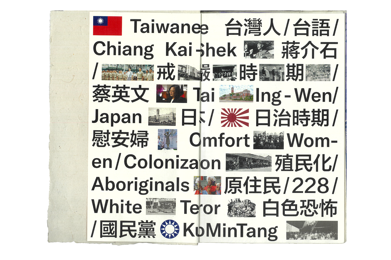
Glossary Spread
I felt like that it is important for the book to include a glossary due to how many Mandarin terms that are being translated and mentioned throughout the text of the book. I want to continue the use of big text for a sense of friendliness towards the reader in the glossary as well, so through the combination of image and text, I created a spread in the beginning of the book as a pre-cursor to the book.
 Glossery Spread