OK
Creating the visual identity for a social campaign on toxic positivity. Thus I decided to go with the idea of saying “I am ok”, in which ‘OK’ became the title of the campaign. The way ‘OK’ can be said varys, which is why I decided for the logo itself to be variable, where the text pushes and pulls based on its environment.
The campaign should also be fun, eye-catching and bold. Which is why I chose to use a simple colour palette with hot pink as its primary colour. I have also dictated within the identity to have the images used to be in pink duotone.

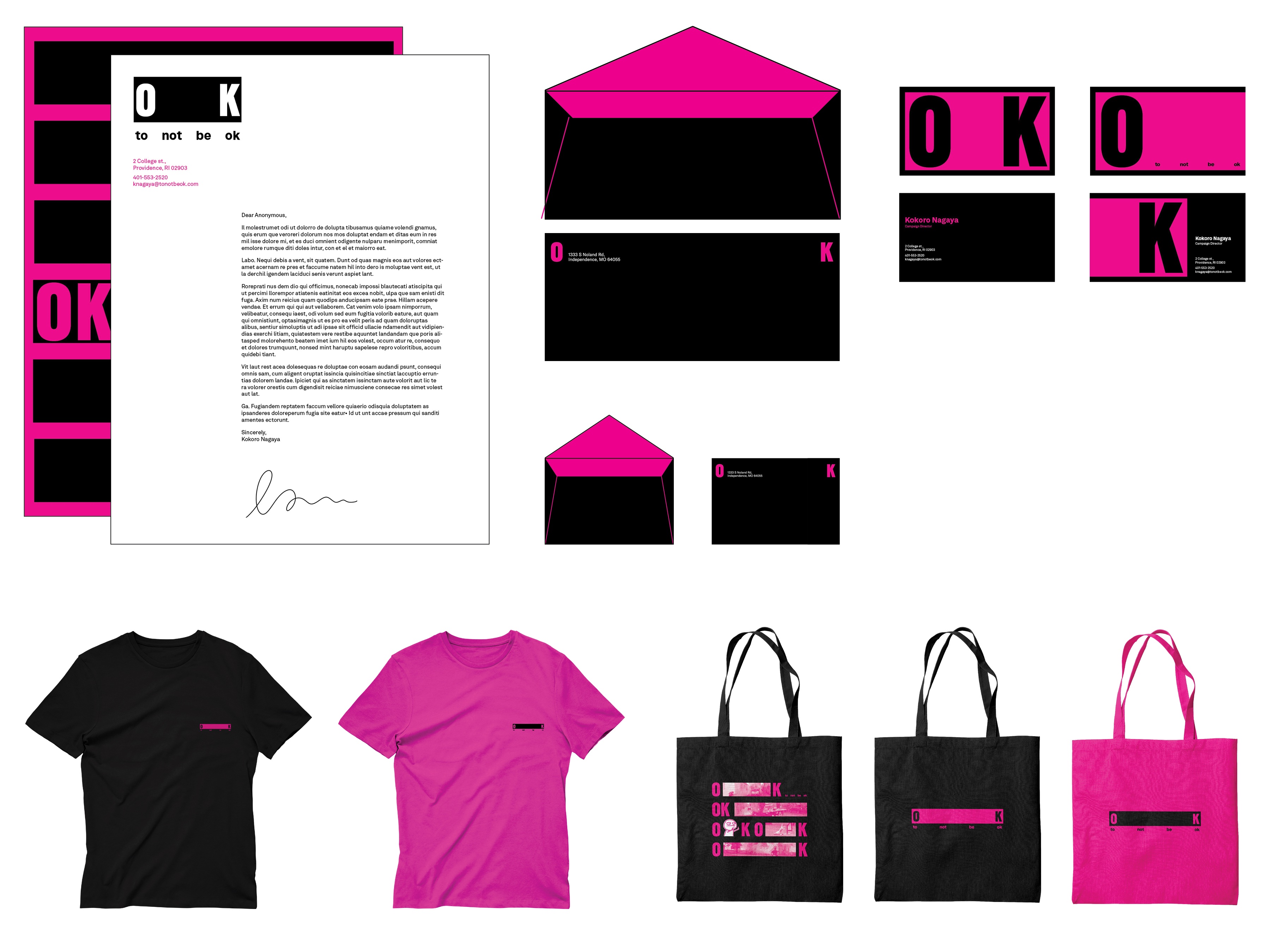
Stationary
The logotype uses the font Sharp Grotesk due to the bold and simple nature of the typeface. As the identity revolves around the use of the logotype, the typeface had to be simple yet containing fun elements.
Poster and Advertisement
For the design of the advertisement and poster, I wanted to bring the fun and quippy personality of the identity into it. Thus the focus was often the image of moments where certain things are not ok, with the logo layered over it. In the poster, the words ‘OK’ follows the pre-established grid system of the design, with the slogan and text explaining the social campaign following it as well.

Poster Series

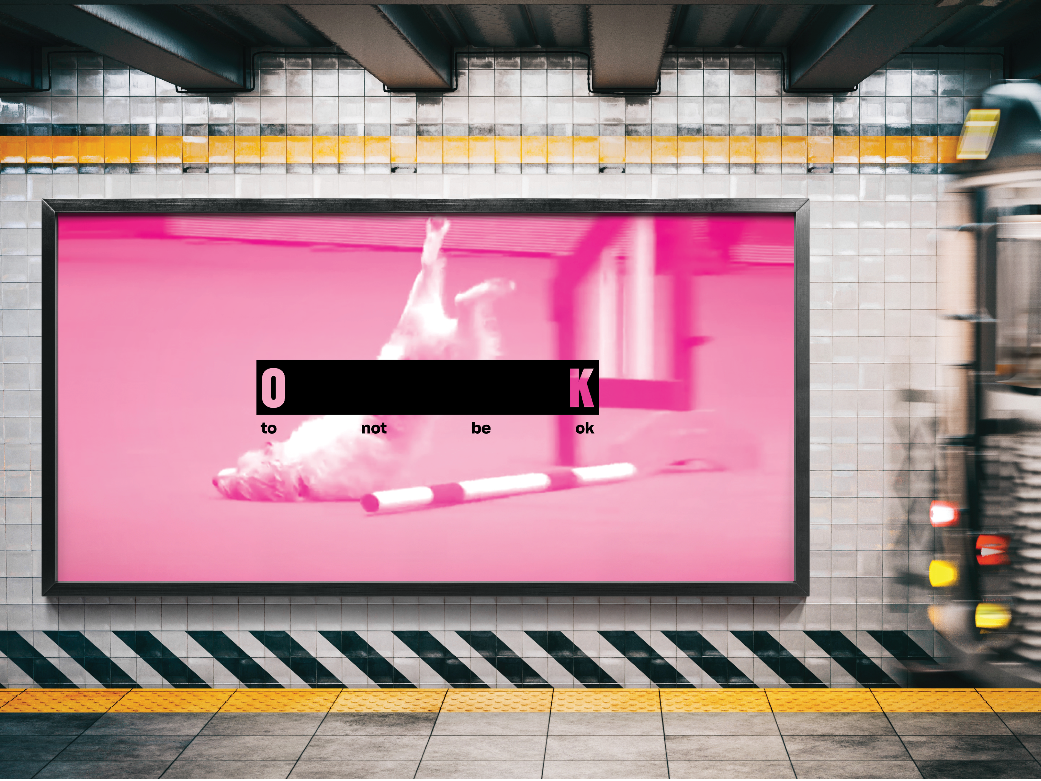
Subway Advertisement Series
Web and App Design
For the design of the website and app, I wanted to use the established grid system within the identity to create the layout of the website and app. Thus I played around with how the letters of the logo pushes and pulls based on the image.
Web and App Design
For the design of the website and app, I wanted to use the established grid system within the identity to create the layout of the website and app. Thus I played around with how the letters of the logo pushes and pulls based on the image.

Web and App Design
Engagement Piece
‘When Life Gives You Lemons’ is the pop up store name where lemonade and lemonade making kits are sold. This is to raise the awareness of the idea of toxic positivity through using the form of the lemon and the phrase “when life gives you lemons”. Designed to be a way to interact with people during the summer, food trucks would be place around parks selling lemonade and kits to the public.
Engagement Logotype Motion

Lemonade Truck

Lemonade Bottle Design

Lemonade Making Kit Design
The lemonade sold comes in different sourness levels, as the idea is that life is not just sweet and that’s ok, as assuming that you have to turn sourness into something sweet is just absurd. Everyone is in a different place in their lives, and we should be ok even if our lives isn’t always sweet.
The lemonade sold comes in different sourness levels, as the idea is that life is not just sweet and that’s ok, as assuming that you have to turn sourness into something sweet is just absurd. Everyone is in a different place in their lives, and we should be ok even if our lives isn’t always sweet.
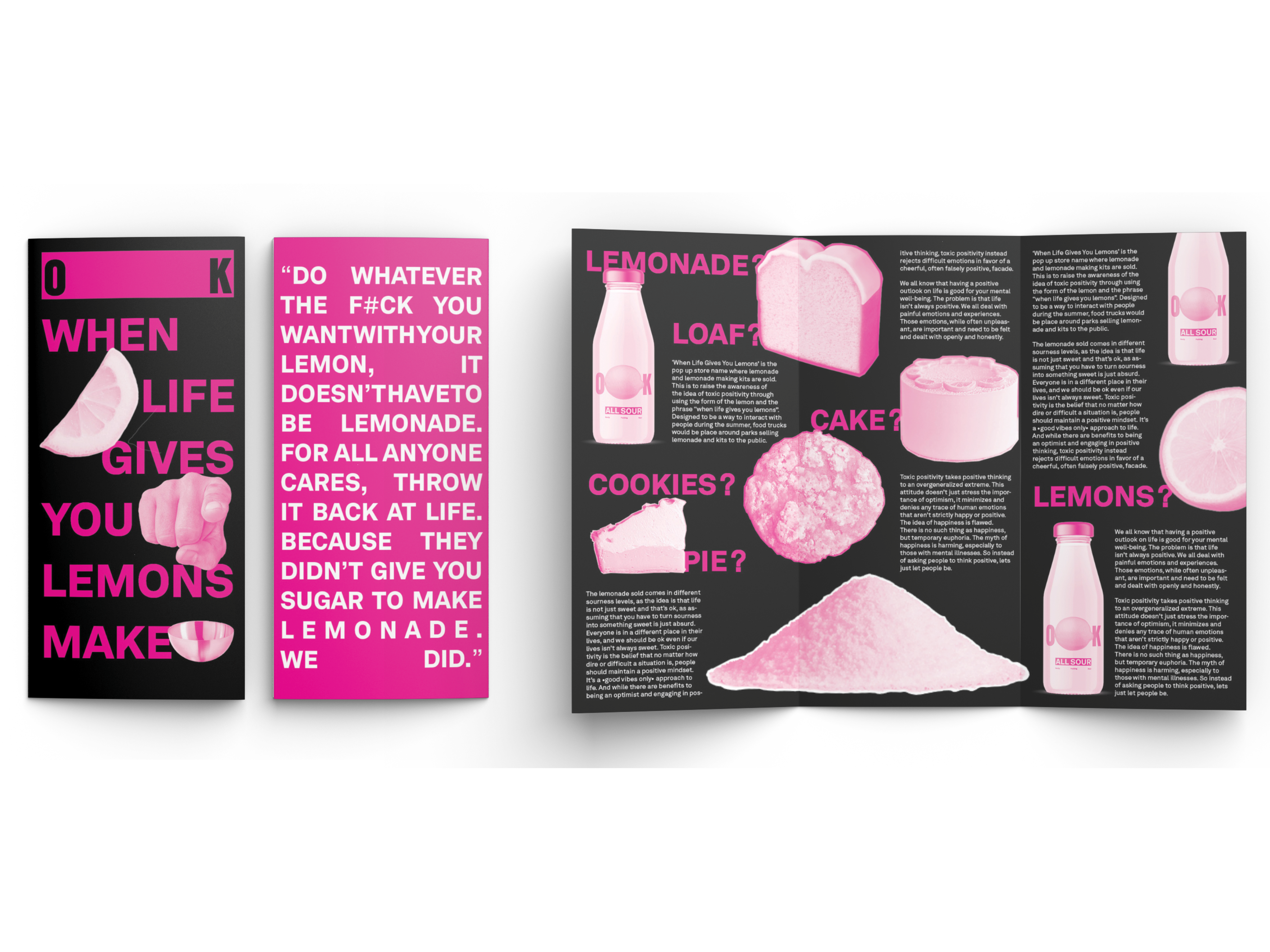
Brochure Design
The concept of the chair simplified into a line dividing the type could be used in different applications. Thus the logo itself creates a grid in which posters, website, and advertisment can all use as a foundation for the design. The specific component of the logo of the line can also be used to create patterns of abstracted chairs stacking that can also be visualized as textiles.