MillerKnoll WRL

Re-designing the MillerKnoll’s Workplace Research Library (WRL) logo, the final solution keeps in mind MillerKnoll’s Bauhaus history of “less is more” as well as the company’s emphasis on viewing the furniture as an architectural and sculptural form. So the form of the chair is reduced and simplified down to its most basic visual form, a single line. The type, representing the textiles of the chair, sits on the line. The ergonomic nature of MillerKnoll’s chair is also important to keep in consideration, so the logo is made to be variable, where it changes and mutates based on the application and surrounding, The logo carries through to the different applications in the form of the grid system the line creates.


Book Cover and Binding (with details printed on translucent paper
The logotype mainly uses the shortened version of Workplace Research Library (WRL), though it is flexible. The typography is from Sharp Grotesk by Sharp Type Foundry, but modified by rounding the corners within the counter of the type. This is done to re-create the feeling of the textiles found in the MillerKnoll chairs. The line component of the logo is created through simplifying the form of the chair, where the type sits on the form in the logo. The single colour present in the logo is chosen to bring in the original identity of MillerKnoll. This is important, as the name itself doesn’t include the company name.
The logo is a variable one, and based on the usage, the logo changes. The main component that changs is the line that moves through the typography. It pulls and pushes, and the typography follows, where the full name is revealed. This can also work through image, where instead of the full name being revealed, an image is revealed and replaces the type.
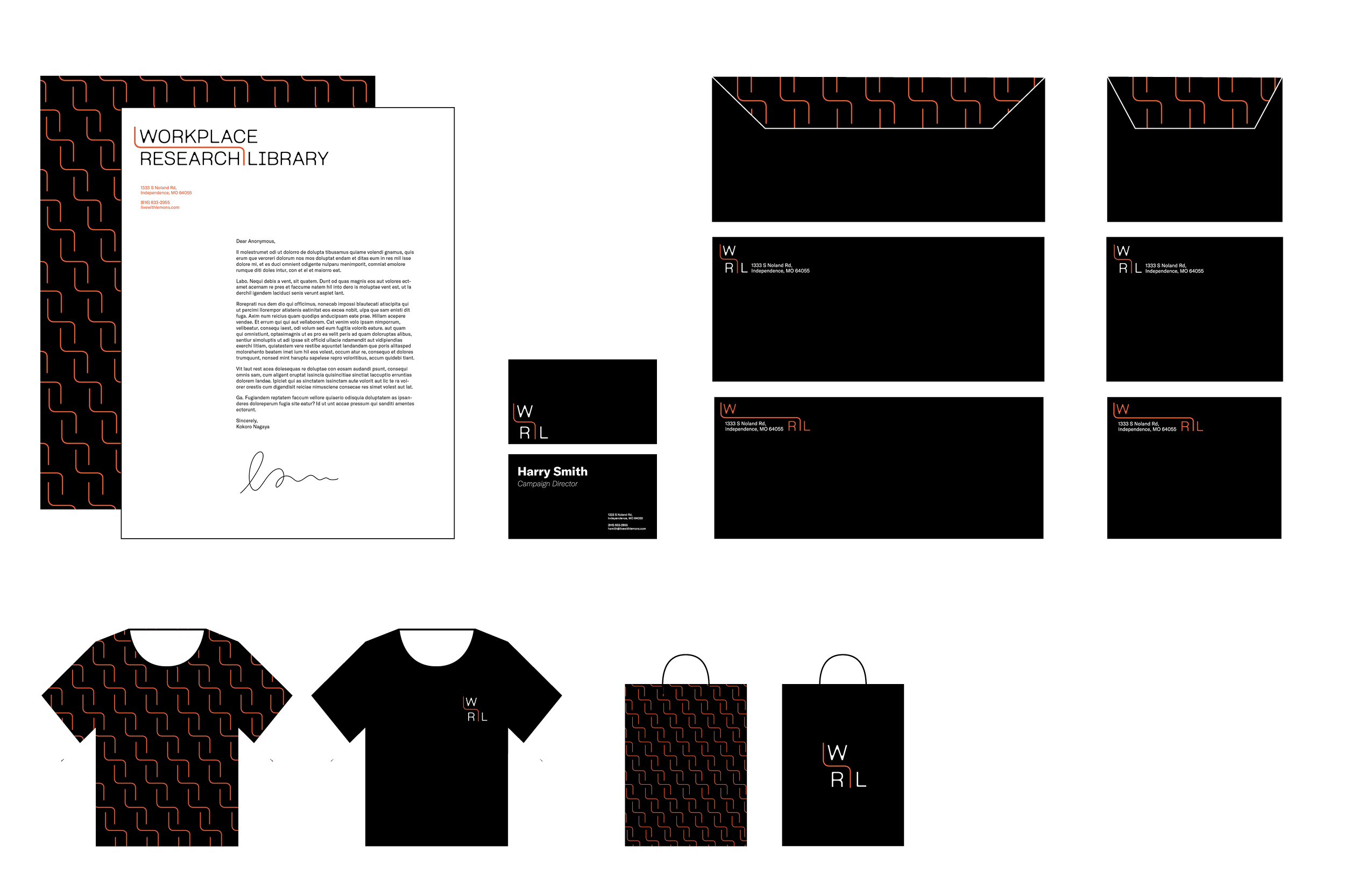
Stationary
The concept of the chair simplified into a line dividing the type could be used in different applications. Thus the logo itself creates a grid in which posters, website, and advertisment can all use as a foundation for the design. The specific component of the logo of the line can also be used to create patterns of abstracted chairs stacking that can also be visualized as textiles.
The concept of the chair simplified into a line dividing the type could be used in different applications. Thus the logo itself creates a grid in which posters, website, and advertisment can all use as a foundation for the design. The specific component of the logo of the line can also be used to create patterns of abstracted chairs stacking that can also be visualized as textiles.

Poster Series
In order to best showcase the problem to the mostly unknown public, I decided to create an energy drink brand where it will mostly target other gamers in the community, but as well as the general public who is not part of the e-sports community.
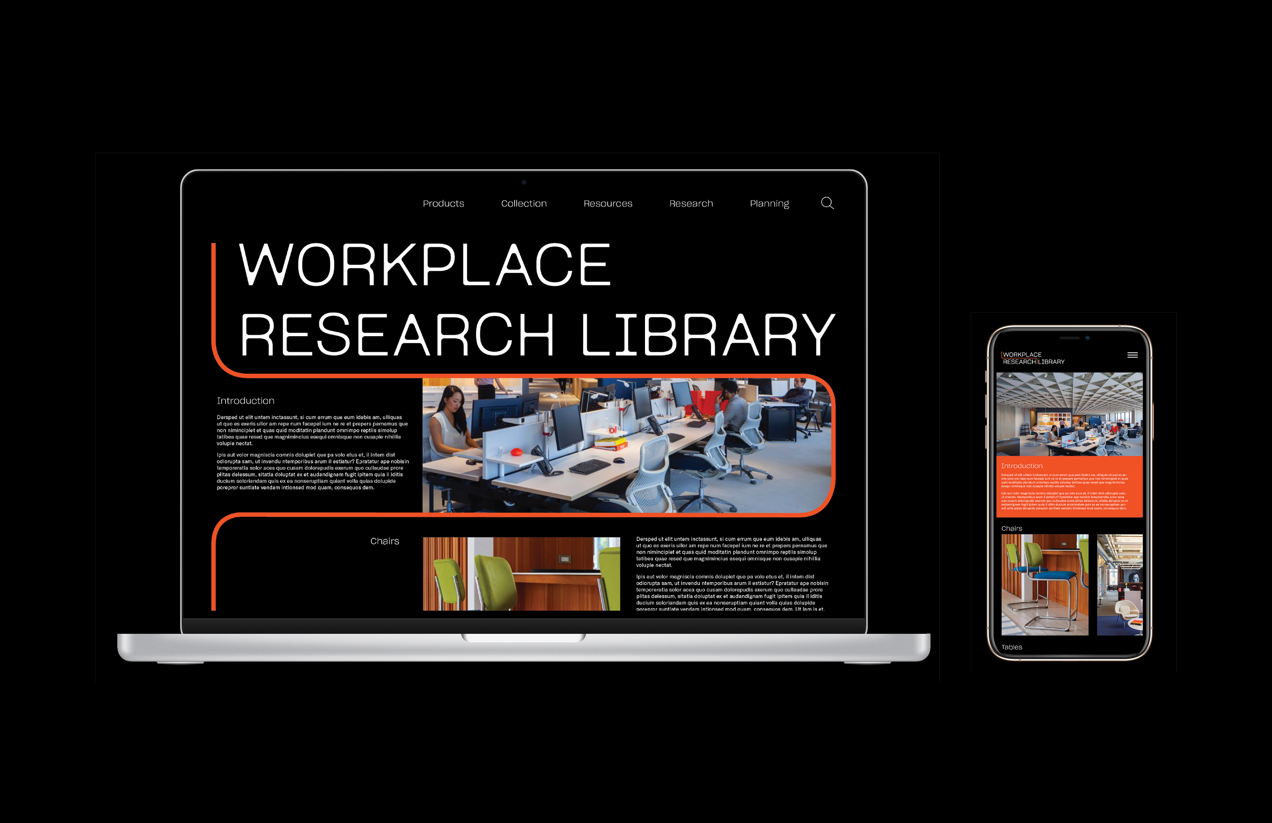
Web and App Design
The concept of the chair simplified into a line dividing the type could be used in different applications. Thus the logo itself creates a grid in which posters, website, and advertisment can all use as a foundation for the design. The specific component of the logo of the line can also be used to create patterns of abstracted chairs stacking that can also be visualized as textiles.
MillerKnoll Workplace Research Library Complete Brand Guide ︎︎︎