A Fisherman of the Inland Sea


Book Cover
For the book cover, I wanted to keep it simple. Since the typefaces I have chosen have a very western appearance, I wanted to bring in the Japanese influence from the 'Tale of Urashima Taro'. Thus the cover paper I chose is influenced by traditional Japanese paper, and the simplicity of the design is also inspired by the simplicity of most Japanese designs. Furthermore, I also wanted to create a sense of loneliness and emptiness through the depth of the sea, which is done so through the simplicity of the illustrations and the cascading title of the secondary text which leads one down the sea.


Inner Pages
Inner Pages
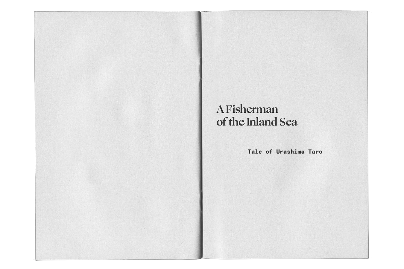
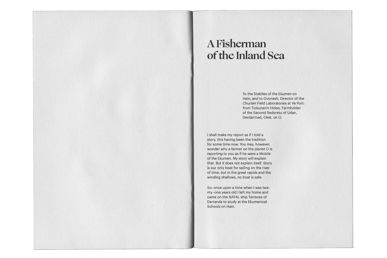
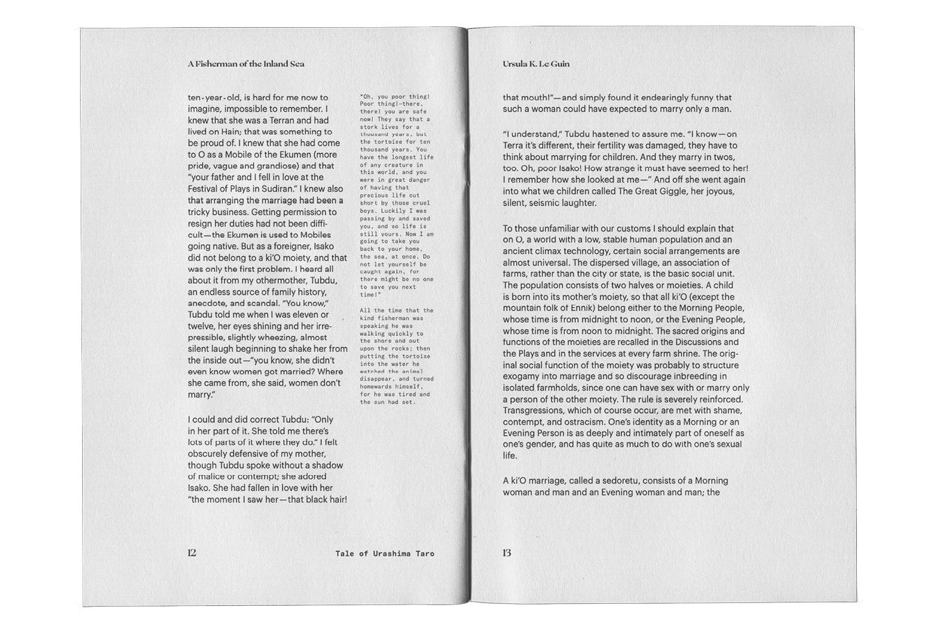
The text begins with two paragraphs similar to an introduction to the text. Written almost similarly to the style of a letter, I decided to move the first paragraph to the right edge of the margin and the next back to the left. This, at the end of the text, I also do with the final paragraph of 'A Fisherman of the Inland Sea'. Which is also written similarly like the end of a letter.
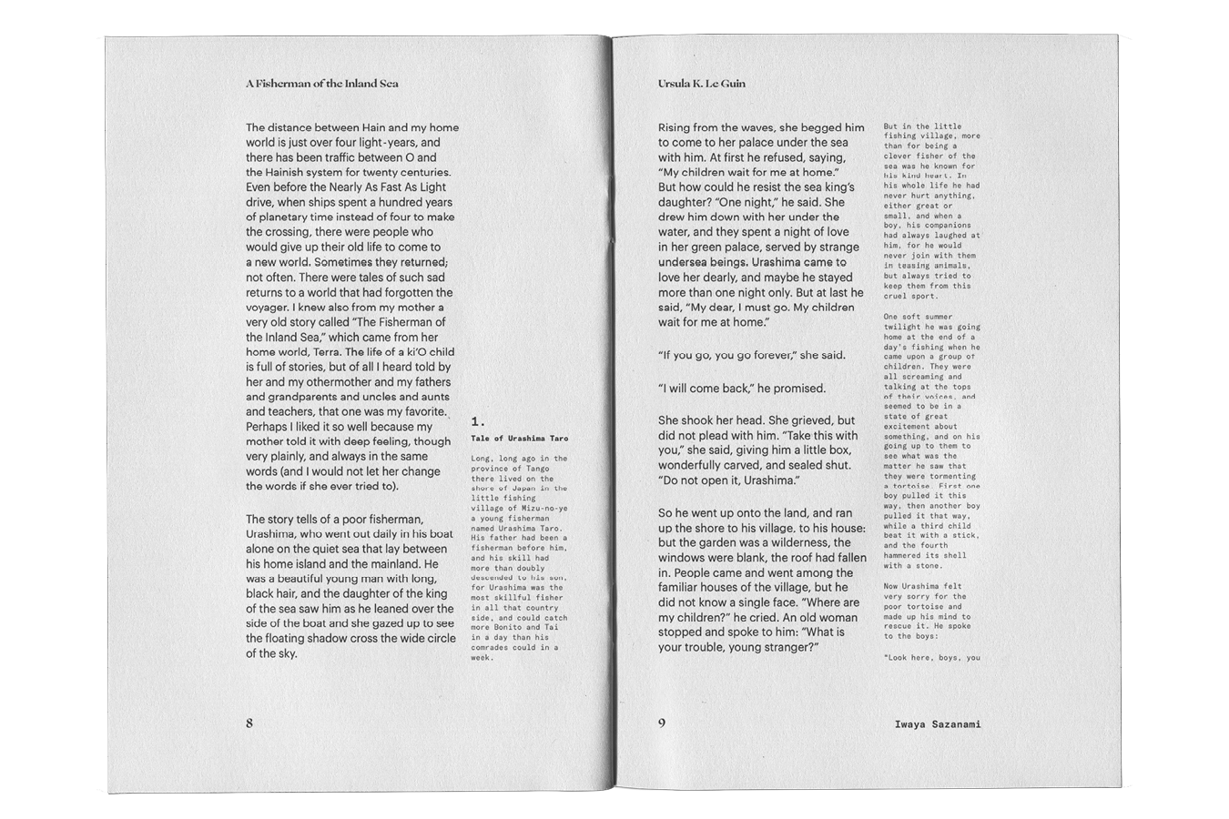
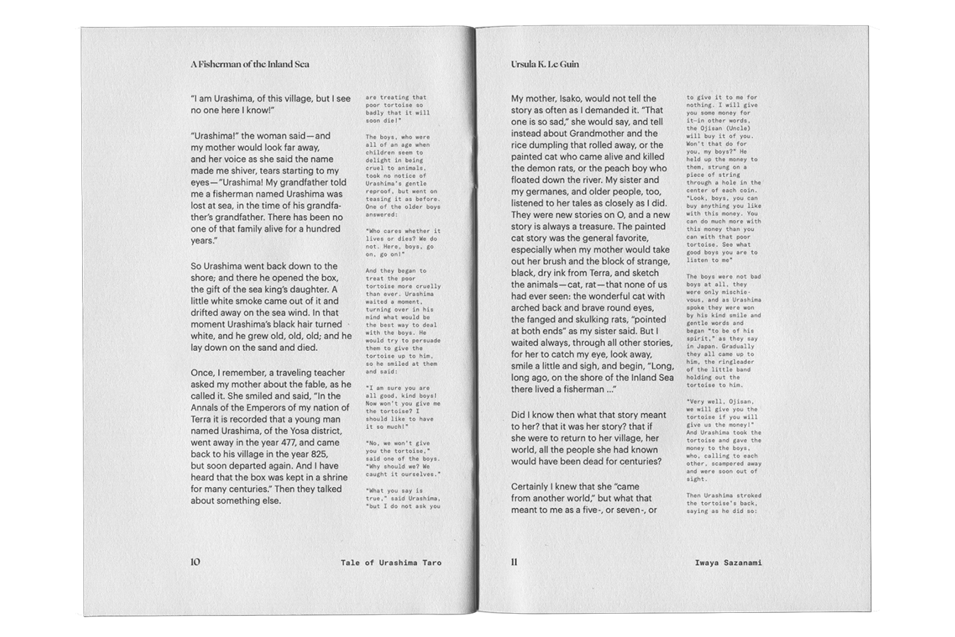
The secondary text is then split into three sections where it is introduced when the story correlates to the primary text. The typesetting of the two text when the secondary text is introduced is different compared to when it is just the primary text. The primary text takes up two thirds of the space whereas the secondary takes up a third. Accompanying the primary text on the side.
Inner Pages
The text begins with two paragraphs similar to an introduction to the text. Written almost similarly to the style of a letter, I decided to move the first paragraph to the right edge of the margin and the next back to the left. This, at the end of the text, I also do with the final paragraph of 'A Fisherman of the Inland Sea'. Which is also written similarly like the end of a letter.
The secondary text is then split into three sections where it is introduced when the story correlates to the primary text. The typesetting of the two text when the secondary text is introduced is different compared to when it is just the primary text. The primary text takes up two thirds of the space whereas the secondary takes up a third. Accompanying the primary text on the side.
For the typefaces that I chose for the book, I decided on Ogg and Graphik for 'A Fisherman of the Inland Sea' and GT America Mono for the Tale of Urashima Taro. Ogg, a more contemporary version of a serif, allows for the book to feel a bit more traditional, but also give it a new and more modern look. Accompanied by Graphik, the more modern take on the book is also kept. Then, the use of GT America Mono also then pulls back the look of modernity from the Graphik typeface and brings back a bit more of the feeling of the 20th century.


Relief Spread
One of the most important thing to me when considering what to create for the relief spread is to create a big difference between the text itself and the relief spreads. One way this was done is through the huge difference of the text size between the relief spread and the text. Furthermore, as I was creating the relief spreads, I wanted to recreate the flow of the sea with the rags of the sentences I have taken from 'A Fisherman of the Inland Sea'.
One of the most important thing to me when considering what to create for the relief spread is to create a big difference between the text itself and the relief spreads. One way this was done is through the huge difference of the text size between the relief spread and the text. Furthermore, as I was creating the relief spreads, I wanted to recreate the flow of the sea with the rags of the sentences I have taken from 'A Fisherman of the Inland Sea'.